

Maps can be remarkably powerful tools for understanding the world and how it works. Here is a collection of maps that may have you looking at our planet in a completely different way and, who knows, it may just unleash your inner cartographer too.
1. Population density and income worldwide
http://www.washingtonpost.com/blogs/worldviews/files/2014/01/H1NbxJ2-1.jpg
Using dots, this map shows population density around the world; the brighter the dot, the more people. Each country is also coloured according to its average annual income: blue is richest and beige is poorest. Here we see that China and India, despite being the two most populous countries, are both lower middle class when income is averaged per capita.
2. The happiest and least happy countries
http://www.washingtonpost.com/blogs/worldviews/files/2013/09/happiness-rankings.jpg
Despite the boisterous events over the past five years, global prosperity has been on the rise, leading more and more countries to be happier with their social and economic standing. Norway, Sweden, Canada and New Zealand are the world’s happiest and are countries that enjoy peace, freedom, good healthcare, quality education, a functioning political system and considerable opportunity. At the other end of the happy spectrum, we have Chad, Congo, Central African Republic, Afghanistan and Yemen, countries long experiencing political strife and social tensions.
3. Human migrations
http://www.washingtonpost.com/blogs/worldviews/files/2014/01/26271801-1.jpg
From about 60,000 years ago, groups of human beings emigrated from Africa separately and in their own time across the world, taking their small genetic differences with them. This map shows where those waves of migration went and when they occurred (the ‘40K’ over Europe means human beings arrived there about 40,000 years ago). You can see that human beings have the most history in the Middle East, India and of course Africa itself.
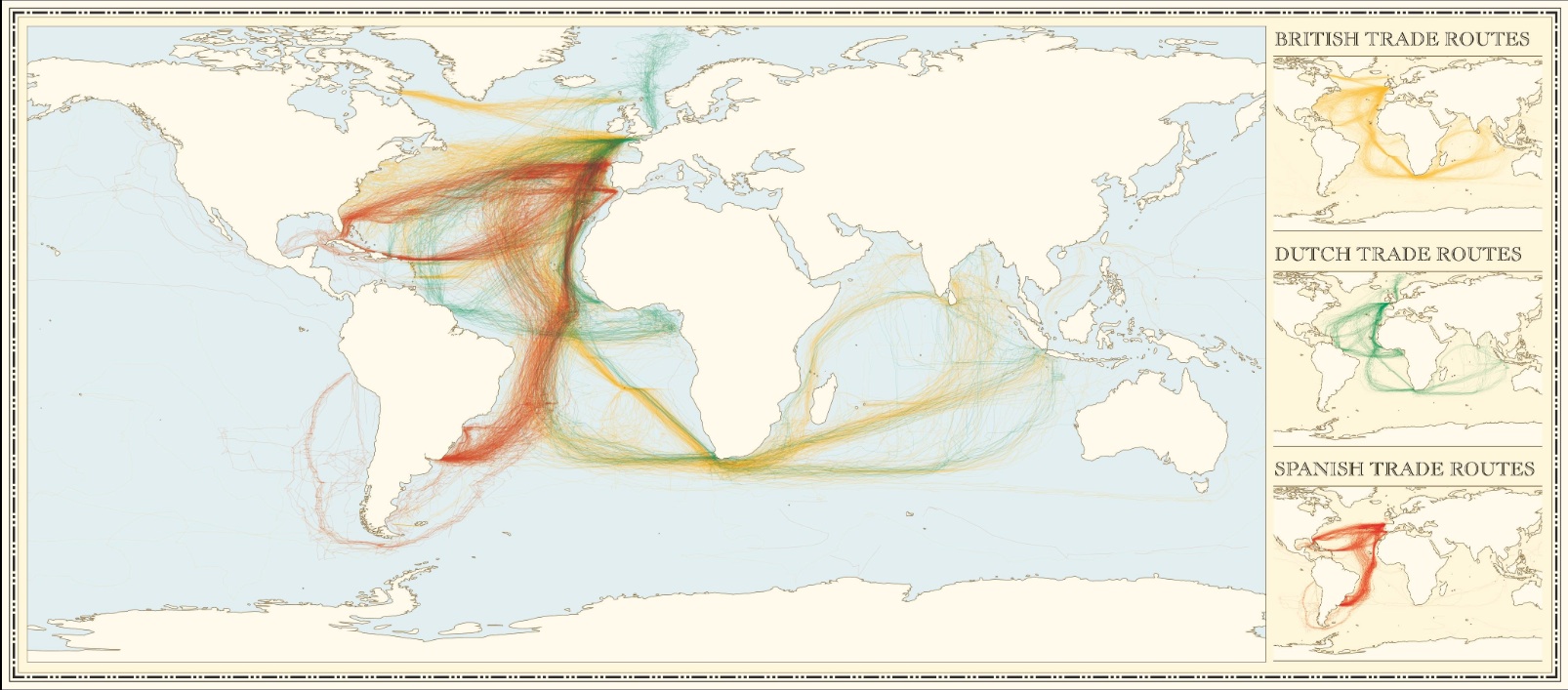
4. Colonial trade routes
http://www.washingtonpost.com/blogs/worldviews/files/2014/01/info_history_shipping_sml.jpg
In digitizing information from the log books of early ships, this map shows British, Dutch and Spanish shipping routes from 1750 to 1800. These lines represent the contours of empire and of European colonialism; showing that travellers from all three nations constantly voyaged between the old and new worlds for trade. However, while the Spanish set up base in both North and South America, the Dutch largely stayed around the South (and the Caribbean), and the British set their eyes on the North.
5. The empires of Africa, before colonialism
http://www.washingtonpost.com/blogs/worldviews/files/2014/01/African-civilizations-map-imperial.png
This map of indigenous African empires spans two thousand years, from 500 B.C. to 1500 A.D. Although they are positioned concurrently, in reality, many existed centuries apart. The map portrays the richness and diversity of sub-Saharan Africa with its vast empires long prior to European arrival. The Songhai Empire, in particular, at its peak in the 14th century, was the most dominant and thriving force in Western Africa and a hub for global learning.
6. If Africa was not colonized
http://developmentdaily.files.wordpress.com/2013/07/alkebu-lan-1260.jpg
If Africa had never been colonized, this is most probably what the continent would have looked like subverted. The map was conceptualized by the Swedish artist Nikolaj Cyon, who drew these boundaries based on an analysis of political and tribal units in 1844, the eve of the European ‘scramble for Africa.’
7. Religious division in modern-day Middle East
http://www.washingtonpost.com/blogs/worldviews/files/2014/01/Syria_Religion2.jpg
A majority of the recent and historical conflict in the Middle East have arisen from religious tensions, particularly among Sunni and Shia Muslims in Syria and Iraq. This map shows the large extent of divisions which cross national boundaries, composing patches of different religious clusters in the region.
8. World airline routes
http://infographics-images.idlelist.com/wp-content/uploads/2012/11/world-airline-routes.jpg
The airplane is one of the most revolutionary inventions of all time. It has affected the world in so many ways, particularly when it comes to the ease of transporting individuals across the globe. This map shows airline routes worldwide. The busiest air routes are located between North America and Europe. The passenger air routes between London’s Heathrow and New York’s John F. Kennedy is among the world’s busiest, transporting roughly 2 million passengers per week.
9. Melting ice caps
http://www.washingtonpost.com/blogs/worldviews/files/2014/01/natgeo.jpg
Although it is unclear as to when the polar ice caps will melt completely, if and when they do, sea levels are expected to rise by 216 feet, as portrayed in this map. Coastal cities, beware!
10. Major oil trade movements, 2012
http://www.bp.com/content/dam/bp/images/core-editorial-main/Major_trade_movements_2012.jpg
In 2012, the global oil trade grew by 1.3%, or 0.7 million barrels/day. At 55.3 million barrels/day, trade accounted for 62% of global consumption, up from 57% a decade ago. This has had a large impact regionally. In particular, growth in net exports from Canada and North Africa, together with reduced US oil import dependence, has offset declining exports from several regions.
11. Australia’s sparse demographics
http://melbourneer.com/wp-content/uploads/2013/11/csUQFm23.png
Although the sixth largest country in the world by area, Australia is ranked 51st in population size. Its population density is 2.9 people per square kilometre, making it one of the least densely populated countries in the world. In some areas of the country, it’s worse! Only 2% of the Australian population lives in the yellow area pictured on this map.
12. Pacific naval power
http://www.washingtonpost.com/blogs/worldviews/files/2014/01/PACOM.png
Even after WWII, the Pacific Ocean is still heavily militarized and the current balance of naval power between Pacific countries has been charted out in the graphic below. Japan still has a pretty substantial navy. So does Russia, a legacy of the Cold War. China’s is, of course, growing substantially. The country has constructed the world’s second-largest naval service, after only the United States.
13. Toilets in India
http://www.washingtonpost.com/blogs/worldviews/wp/2014/01/13/40-more-maps-that-explain-the-world/
Despite being an economic powerhouse, much of India remains under poor conditions and poverty. This map was created using Indian census data and shows the colossal disparity among the approximately 47% of households across the country that reported having a toilet, many of which are located in India’s larger urban centres.
14. What it takes to make Nutella
http://www.washingtonpost.com/blogs/worldviews/files/2014/01/nutella-map.jpg
A map exemplifying the ultra-globalized economy of today. A jar of that precious chocolaty Nutella requires natural resources from four continents, vast manufacturing facilities in entirely different countries and a supply and distribution chain that spans the globe. Nutella, it turns out, is a perfect example of what globalization has meant for popular foodstuffs.
15. Internet usage over 24 hours
http://internetcensus2012.bitbucket.org/images/geovideo.gif
This map shows the average Internet usage via a computer over a 24-hour period. Look closely to see the traffic move with the daylight. Usage is pretty much nonexistent in Africa, along with large parts of Canada and Russia. In the future, however, these types of visualizations are bound to get more complex and expansive, particularly with cheap smartphones taking off in Africa and $20 tablets popping up in India, facilitating connections around the world by the minute.


